Not Just an Average Power Meter
Posted by Andrew Buckrell on October 23, 2020
Although the topic of power averaging sounds like one of the most boring, run-of-the-mill conversations you can imagine, it’s an area that deserves a proper discussion, as it affects literally every power measurement that you ever see. It’s only fair that we properly explain what’s going on in the background.
It’s pretty intuitive that each full crank rotation will have two large spikes in torque, specifically when each of your legs are pushing downwards. We can all agree on this point. It would then make sense that if we measure the instantaneous power (think of it as a sprint that’s lasting a fraction of a crank rotation) at these points, it will be much higher than the average power, since part of your pedal stroke will be much lower power (and the average falls in between). You can see this in the figure below.
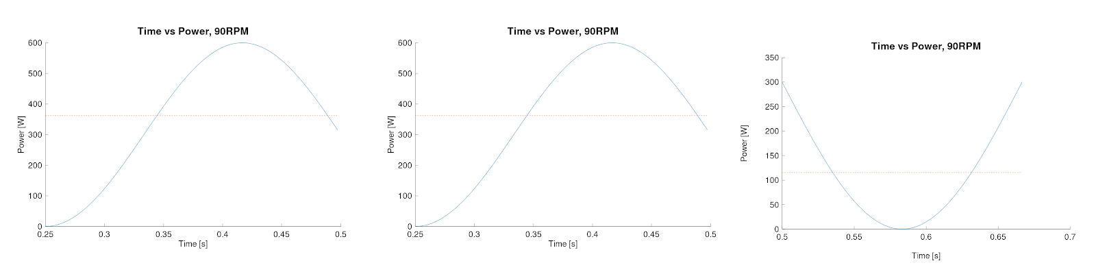
Time vs. Power, different segments
The average power of the full crank rotation is shown in the dotted line, and I think this is something that people would generally agree with. Looking at this, the peak instantaneous power is around 600W, but the average is only 300W. That’s definitely food for thought.
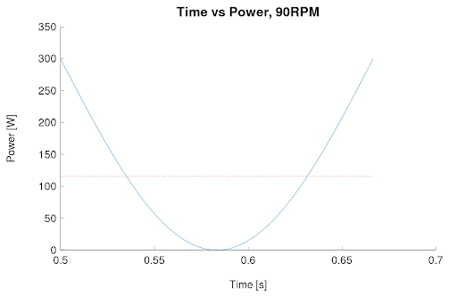
Time vs. Power, different segments
If you were to see the above power trace from a ride, the average of each trace would be shown by the dotted lines again. Make sense so far? We’re looking at a bunch of curvy lines (sinusoidal, is the mathematical term), and taking the average value.
What about when I point out the timescale on both of the horizontal axes? This is only taken over a quarter of a second, which is about ½ to ⅓ of a pedal rotation, depending on your cadence. These average values are also taken over a single pedal stroke, so how can it make sense that the overall average is still 300W? Well, this all comes down to averaging time, and is one of the reasons that different power meters can show data that appears to “jump around more”. This is in fact due to the power meter actually showing you better data. ANT+ data is displayed 4 times per second, so if you’re only including these quarter second bursts, it can lead to wildly different results showing up on your head unit.
Let’s take a fictitious power trace below. There’s no funny business with the horizontal axis this time – the blue dashed line is a lead up to a sprint, maybe for an intermediate on a tour stage, or something along those lines. The power is relatively low initially, then there’s a big spike for 10-20s, then it goes back down to the background power level. The power shown here is “real”, in that it’s the average per full crank revolution. If you assume the underlying sinusoidal curve shown previously (one for each revolution) and scale it by the average power, then choose to output the data 4 times per second – the output frequency of ANT+, without any averaging, you end up with this mess:
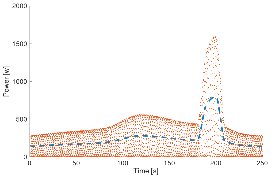
Mathematically, both the dotted line of “real power” and red dots for “instantaneous power” are the same accuracy, just different averaging times used
The red dots would be your power reading seen directly by your head unit if we were only to take the previous 0.25s into account. Note that it’s double the “real” value.
Not useful, right? I think most people would agree, unless you watch your power meter as much as Chris Froome. Maybe this is what he’s looking at? Who knows…
Anyway, having established that entirely unfiltered, high frequency data is not all that useful, you have to do some kind of averaging, but how much does that impact what you see? Taking the same instantaneous data, and averaging it over longer and longer periods, you can see that the trace definitely becomes smoother, but eventually becomes too smooth (which is something that no one has ever accused me of being!). At 0.5s averaging, the data is still pretty noisy, but becoming much more useful. At 5s averaging, the shapes are very similar, but you can actually start to see a bit of a lag. For quick, sharp, sprints, the 5s averaging takes off the “peaks” of the data, and give you less accurate numbers for shorter durations. At the extreme, with 30s to 120s averaging, it starts to look really wonky! This is because all of the previous x seconds are used to calculate the reading. This also means that a sprint 20s ago would impact your current reading, which is not ideal either!
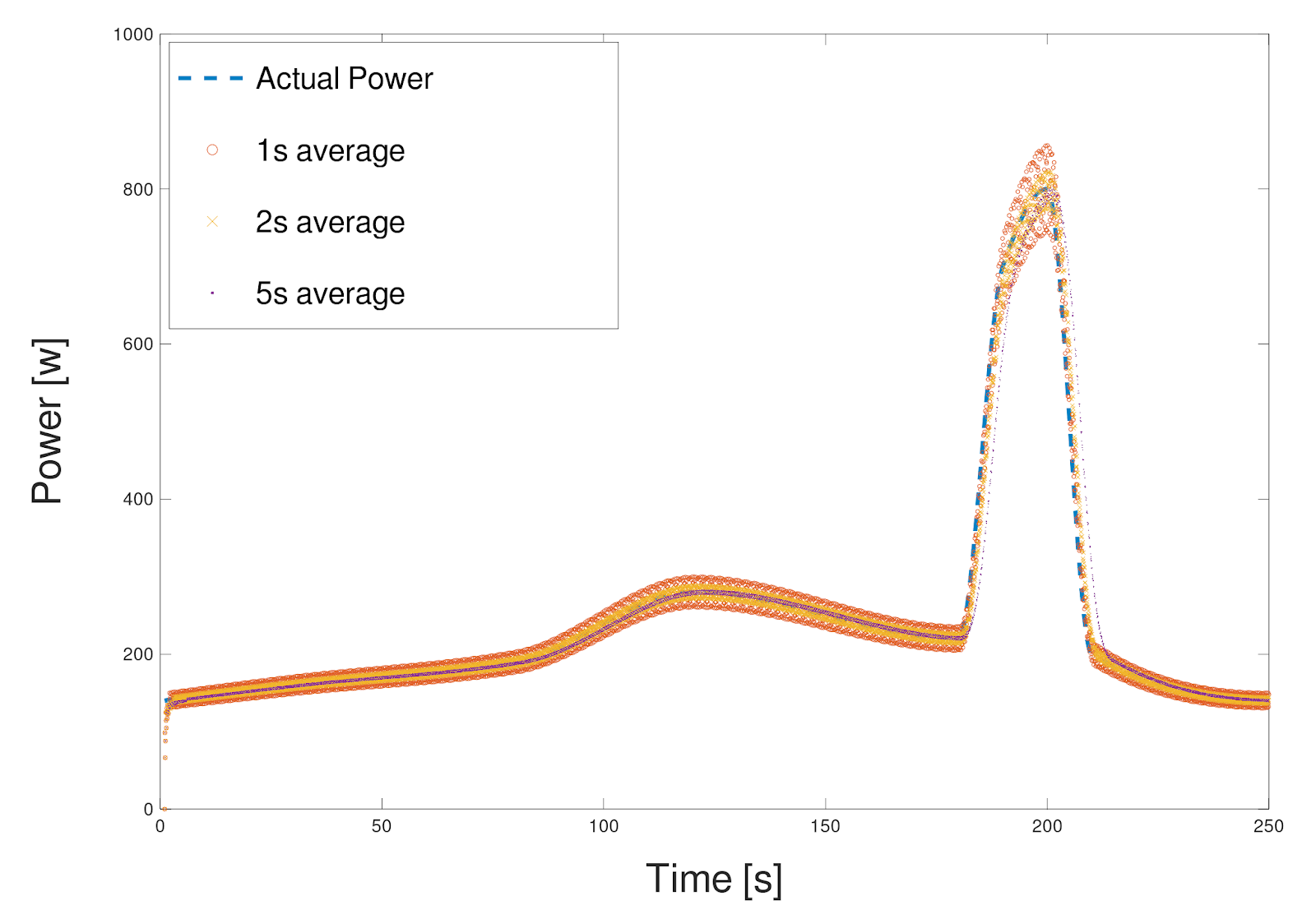
Short timeframe averaging
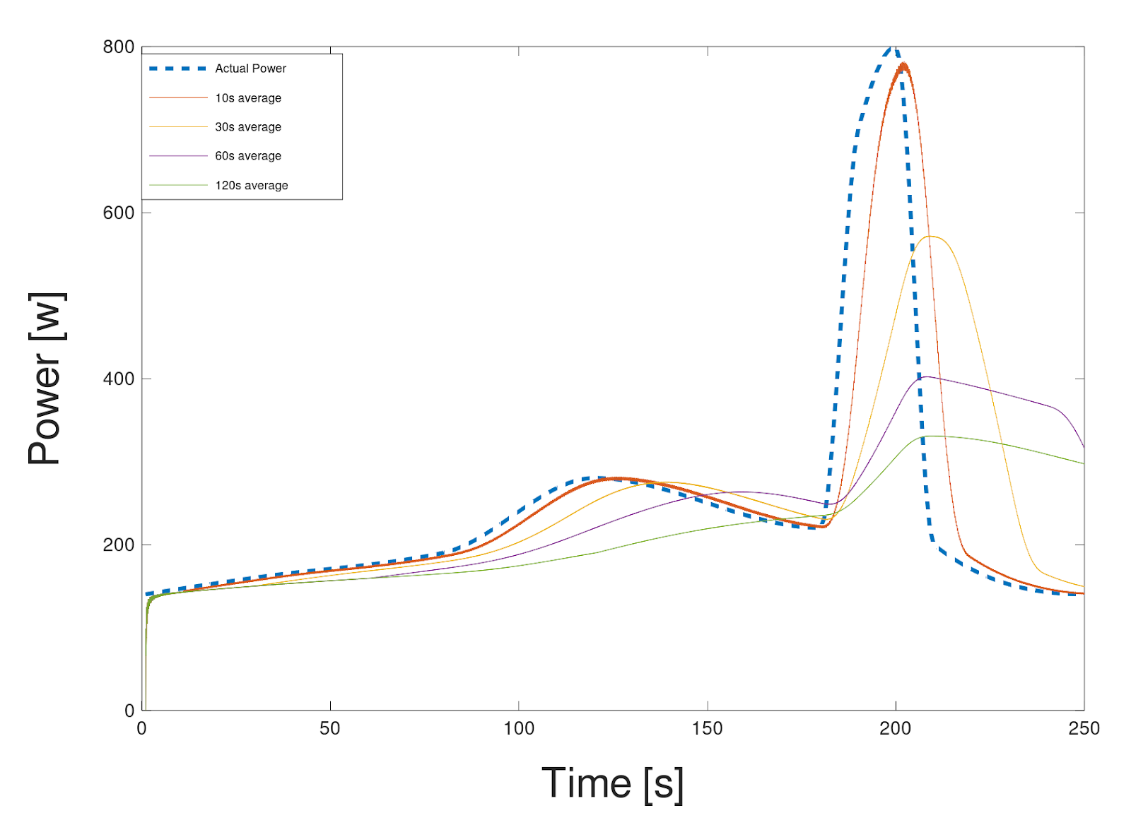
Comparing up to 120s averaging with the “baseline” power
On top of this, your head unit could be averaging the data as well. Averages of averages of averages. It’s no surprise that your true data is starting to become seriously obfuscated. We truly believe in having nothing to hide.
At 4iiii, our data is transparent, and doesn’t undergo any averaging beyond a single crank rotation. This means you get industry best accuracy, full data transparency and best of all, the best power meter value available! Check out the different options in our store. Remember, you don’t want to be average!

